💊 Pill of the week
In the last DIY, we introduced the concept of Exploratory Data Analysis (EDA). This is a fundamental step in Data Science. One of the key components of the EDA is finding out about the data distribution.
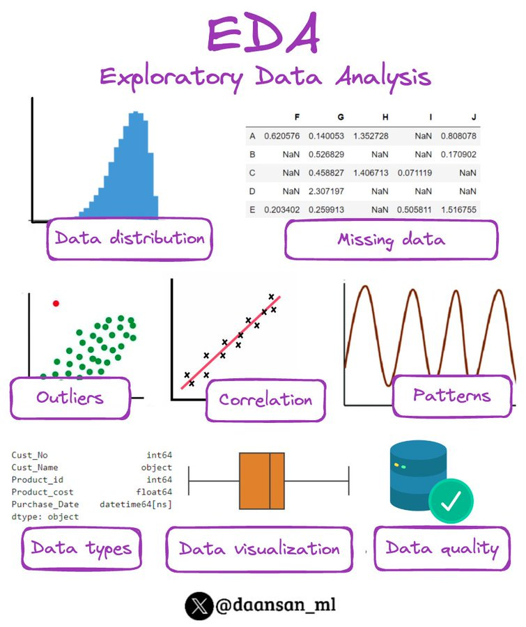
Here is a reminder of what EDA is:
Let’s inspect the data distribution in more depth!
What is data distribution and why do we need to be aware of it?
It refers to how data points are spread across various values, showing the frequency of each value. Being aware of data distributions is crucial because it informs the choice of statistical methods and algorithms for analysis, ensuring accurate and meaningful insights. Different distributions, like normal, skewed, or uniform, can significantly impact data interpretation and the effectiveness of predictive models.
You can check here some of the most common distributions in data science.
Check the distribution of your data
Here you’ll find out how you can investigate how data in each of your features are distributed.
Let’s start by importing the essential libraries for data analysis. These are:
Pandas is a powerful data manipulation library that provides data structures for efficient data handling.
Matplotlib and Seaborn are visualization libraries used for creating various types of plots.
SciPy is employed for its statistical functions, including normality tests.
Histograms and Density Plots
Histograms provide a visual representation of the distribution of each variable. By specifying the number of bins, we can control the granularity of the representation. Density Plots, overlaid on histograms, provide a smoothed representation of the data distribution.
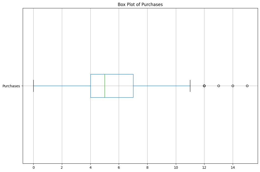
Box Plots
Box Plots visually summarize the distribution of each variable by displaying the median, quartiles, and potential outliers. They are handy for identifying the spread of data and understanding central tendencies.
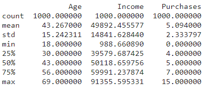
Summary Statistics
Summary Statistics provide a snapshot of key metrics such as mean, standard deviation, and quartiles. This step helps gain a quick understanding of the central tendencies and variability within the dataset.
Skewness and Kurtosis
Skewness measures the asymmetry of the distribution, indicating whether it is skewed to the left or right. Kurtosis provides insights into the tails of the distribution, helping to understand the peakedness.
Normality Tests with Q-Q Plots
Normality Tests, such as the Shapiro-Wilk test, assess whether a variable follows a normal distribution. Q-Q Plots visually inspect the degree of agreement between the observed data and the theoretical quantiles of a normal distribution.
Scatter Plots
Scatter Plots provide a visual representation of relationships between pairs of variables. The pairplot from Seaborn generates scatter plots for all combinations of variables, offering insights into potential correlations and patterns.
These technical details provide a deeper understanding of each step in the Exploratory Data Analysis process, elucidating the specific functions and methodologies used for data exploration and visualization.
You can check how to build each of them in the 🪐Jupyter notebook you’ll find at the end of the newsletter!
🤖 Tech Round-Up
This second week's TechRoundUp comes full of AI news.
Let's discover the top AI & tech highlights of the week!
From Amazon to Google search, the future of tech is unfolding before our eyes.
1️⃣ 𝗚𝗼𝗼𝗴𝗹𝗲'𝘀 𝗚𝗲𝗺𝗶𝗻𝗶 𝗔𝗜: 𝗔 𝗚𝗮𝗺𝗲 𝗖𝗵𝗮𝗻𝗴𝗲𝗿 𝗼𝗿 𝗝𝘂𝘀𝘁 𝗛𝘆𝗽𝗲?
Google unveils Gemini, their latest LLM 🆕
With advanced capabilities, Gemini is set to beat GPT-4 and revolutionize the way we interact with AI.
2️⃣ 𝗠𝗶𝗰𝗿𝗼𝘀𝗼𝗳𝘁 𝗕𝗶𝗻𝗴'𝘀 𝗚𝗣𝗧-4 𝗜𝗻𝘁𝗲𝗴𝗿𝗮𝘁𝗶𝗼𝗻
Microsoft Bing amps up search with GPT-4 🤖
Their new 'Deep Search' digs deeper, delivering comprehensive answers to complex queries.
3️⃣ 𝗠𝗲𝘁𝗮 𝗮𝗻𝗱 𝗜𝗕𝗠'𝘀 𝗔𝗜 𝗔𝗹𝗹𝗶𝗮𝗻𝗰𝗲
Meta and IBM's AI Alliance is here! 🤝
This collaboration fosters open innovation in AI, uniting a wide range of sectors for responsible, inclusive AI advancement
A new era for data! 💥
It combines vector search and graph data, offering unique insights and tackling high-dimensional data and relationships with ease
5️⃣ 𝗩𝗥-𝗕𝗮𝘀𝗲𝗱 𝗦𝗮𝗳𝗲𝘁𝘆 𝗧𝗿𝗮𝗶𝗻𝗶𝗻𝗴 𝗶𝗻 𝗞𝗼𝗿𝗲𝗮
VR meets construction safety training in Korea! 🚧
Researchers propose a machine learning model using VR and biometrics for personalized training.
Learn Advanced Machine Learning Concepts!*
Have you outgrown introductory courses? Ready for a deeper dive?
Explore feature engineering and feature selection methods
Discover tactics for optimizing hyperparameters and addressing imbalanced data
Master fundamental machine learning methods and their Python application
Enroll today and take the next step in mastering the world of data science!
*Sponsored: by purchasing any of their courses you would also be supporting MLPills.
🛠️ Do It Yourself!
Time for you to play with the code!
I will share with you the notebook with almost everything you need. Your task is to make it work and get the results I shared in this newsletter. I provide you with some hints. The best way of learning is by checking the documentation.
Enjoy and good luck!


