


The baseline model covered in this week’s Pill of the Week is honest work. Good AUC, sensible features, a deployable pipeline. But it leaves a lot on the table.

This extra issue walks through the additional Jupyter Notebook that will be sent TODAY:
the distributions we did not show,
the models we compared,
the economics behind the threshold,
the diagnostics that tell you whether your model is actually trustworthy before you put it in front of a retention team.
⚠️The notebook will be sent TODAY at 23:59 PT (to give you more time). It will not be sent again or accessible to new paid subscribers.
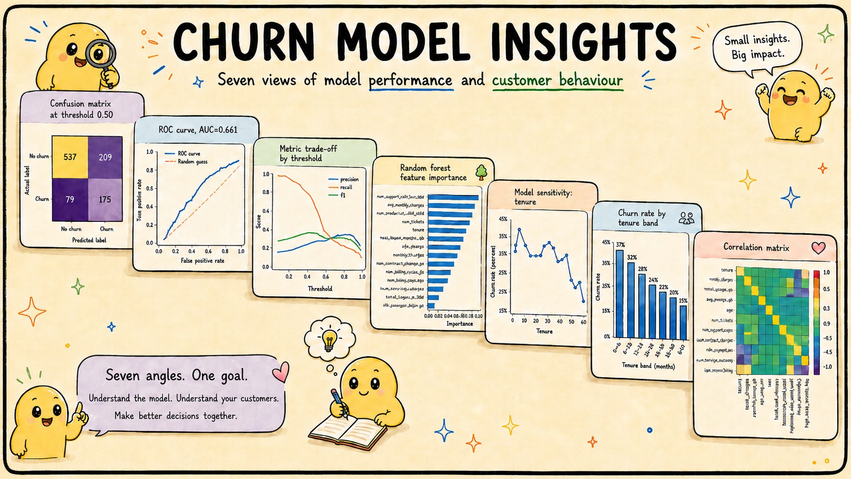
First, the class imbalance you are actually dealing with
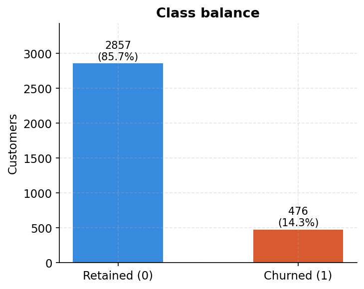
2,857 retained customers, 476 churned. That is 85.7% versus 14.3%. Every modelling decision in the notebook, from the class_weight=’balanced’ parameter to how we read the evaluation metrics, flows from this single chart. A model that predicts “retained” for everyone would score 85.7% accuracy and catch exactly zero churners. This chart is the first thing the notebook plots, and it should be the first thing on your wall when you start any imbalanced classification project.
Tenure: the first year is when customers leave
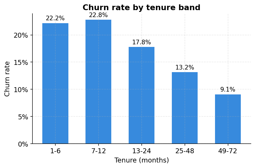
The main issue mentioned tenure as a top feature. Here is what it looks like when you cut the data properly. Customers in their first six months churn at 22.2%. Customers who have been around four or more years churn at 9.1%. The curve is not linear: most of the decay happens in the first two years, then it flattens. This is the loyalty dividend. If you can survive someone’s first contract, the odds shift in your favour.
The practical read: new customers need a different retention playbook than established ones. Flagging a 3-month customer at 25% churn probability warrants a different intervention than flagging a 50-month customer at the same score.
The more you charge, the more likely they leave
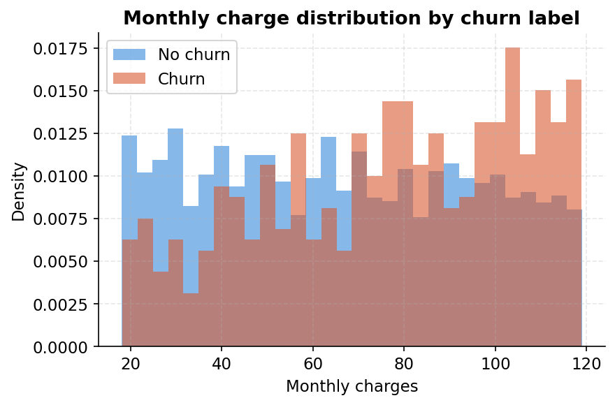
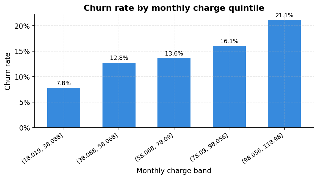
The notebook cuts monthly charges into quintiles and the story is clear: customers in the bottom fifth (under 38 per month) churn at 7.8%. Those in the top fifth (above 98 per month) churn at 21.1%. The distribution chart makes the same point from a different angle. The churner distribution (orange) is shifted noticeably to the right compared to retained customers (blue). High-paying customers are not more loyal. They are more at risk, likely because the bill is large enough to prompt a regular re-evaluation of whether it is worth it.
This is also why monthly_charges ranked second in feature importance in the main issue, behind only support calls.
A proper model comparison: do not skip the dummies
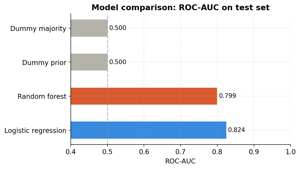
The notebook runs four models side by side before declaring a winner. Two are dummies. This is not academic ceremony. It is a sanity check.
Dummy majority always predicts “retained” and scores AUC 0.50, which is pure chance. Dummy prior predicts with base rate probabilities and also scores 0.50. If your fancy model does not beat these by a meaningful margin, something is wrong with your data, your target, or your approach.
Logistic regression scores 0.824 AUC. Random forest scores 0.799. Logistic regression wins here. This is not unusual on clean tabular data with linear-ish signals, and it is a useful reminder that a simpler model can outperform a more complex one. The notebook uses the Random Forest for the extended diagnostics because it matches the article’s baseline, but in a real deployment you would take logistic regression seriously.
The precision-recall curve: the other view of model performance
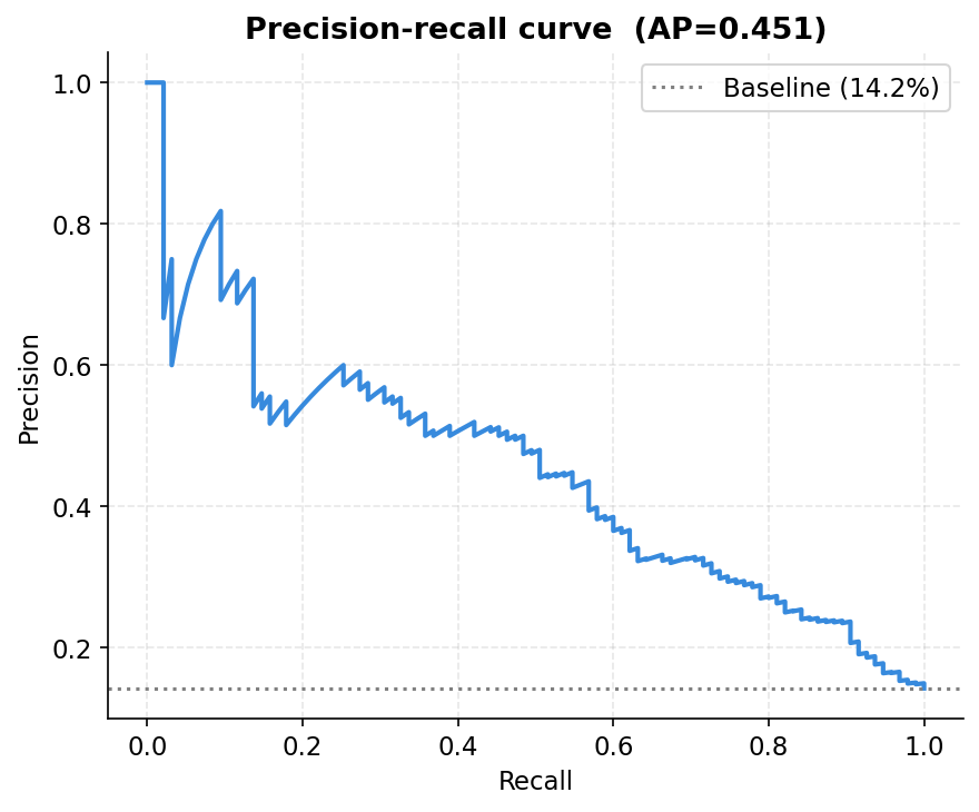
ROC-AUC was covered in the main issue. The precision-recall curve shows something different and, for imbalanced problems, often more informative. Average precision of 0.451 means the model substantially outperforms the baseline (the dotted line at 14.2%, the actual churn rate). Every point on the curve represents a different threshold. The curve tells you: if I want to be right 50% of the time when I flag someone, what fraction of all real churners can I catch? The answer from this chart is roughly 45%. You trade off one against the other by moving along the curve.
The threshold is not 0.5: turning statistics into money
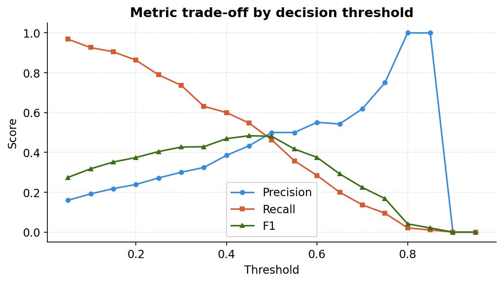
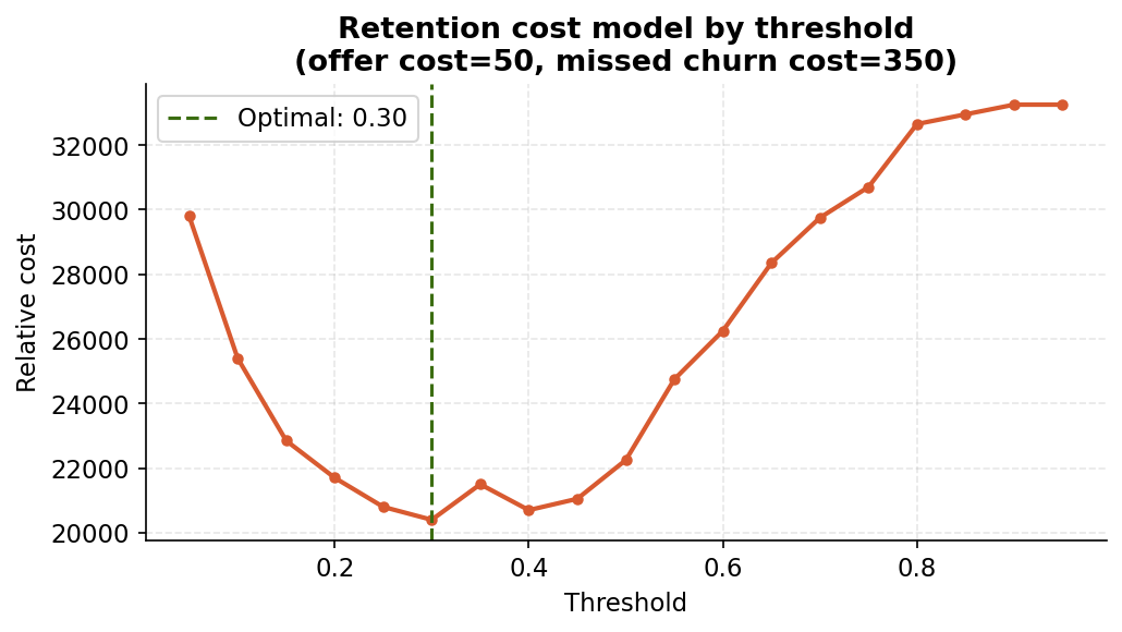
Two charts from the notebook’s economics section. The first shows how precision, recall and F1 move as you change the decision threshold. The crossing point of precision and recall around 0.35 to 0.40 is where F1 peaks. But F1 optimises a statistical average, not a business outcome.
The second chart is more honest. The notebook uses a simple cost model: each retention offer costs 50 units, each missed churner costs 350 units. These are illustrative, but the shape of the curve is robust to reasonable changes in those assumptions. The minimum sits at threshold 0.30. That is lower than the Youden statistic suggested (0.376 in the main issue), because the asymmetric costs push the optimal point toward catching more churners even at the price of more false alarms.
The point is not the exact threshold. It is that the optimal threshold belongs to your finance team as much as your data team. Plug in your actual cost of a retention call and your actual reacquisition cost, and the chart gives you the answer.
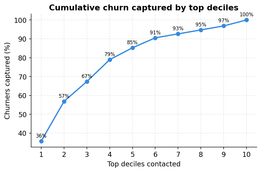
Lift analysis: how much better than random is the model, really?
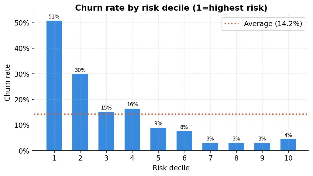
Lift analysis translates model performance into a language every business stakeholder understands. The notebook sorts all 667 test customers by their predicted churn probability and cuts them into ten equal groups (deciles). Decile 1 is the highest-risk tenth.
Churn rate in decile 1: 50.7%. The average churn rate across the full test set: 14.2%. That is a lift of 3.6x. By targeting only the top decile, you spend budget on a group that is 3.6 times more likely to churn than a random customer.
The cumulative capture curve makes this operational. Contact the top two deciles (20% of your customer base) and you have already reached 57% of all churners. Contact the top four deciles (40% of customers) and you have reached 79%. This is how you size a retention campaign: decide how many customers your call centre can handle in a given month, find that point on the curve, and you know what fraction of true churners you will catch.
Calibration: does 30% actually mean 30%?
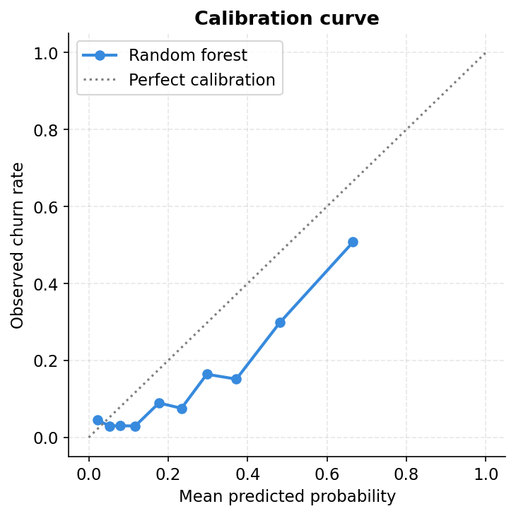
A model can have strong AUC and still be poorly calibrated. A well-calibrated model means that when it says a customer has a 30% chance of churning, roughly 30 out of 100 customers with that score actually churn. A miscalibrated model might say 30% but the true rate is 50%, which would make all the economic threshold analysis unreliable.
The calibration curve plots predicted probability on the x-axis against the actual observed churn rate on the y-axis. A perfect model follows the diagonal. This Random Forest tracks it reasonably well at the lower end but nudges slightly above the line at medium probabilities, meaning it is modestly overconfident in the middle range. For a production system you would apply Platt scaling or isotonic regression to correct this. For a baseline model it is a tolerable level of miscalibration.
Permutation importance: a harder test than Gini
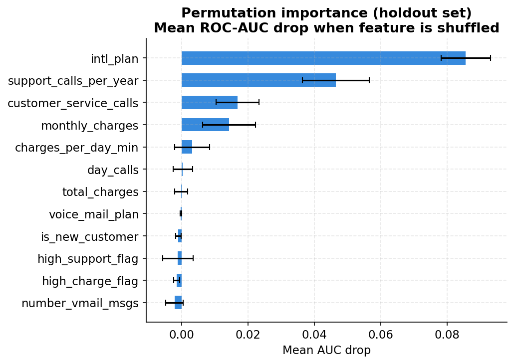
The main issue showed Gini-based feature importance from the Random Forest. Permutation importance asks a tougher question: if I randomly shuffle this feature on the held-out test set, breaking any relationship it has with churn, how much does AUC drop?
The results are striking. International plan drops AUC by 0.086 when shuffled. This is the single most informative feature by this measure, outranking support calls (0.017) and monthly charges (0.014). The engineered feature support_calls_per_year ranks second at 0.047, above raw customer_service_calls. Rate of frustration relative to how long someone has been a customer turns out to be more informative than the raw count.
Several features show near-zero or slightly negative permutation importance. Negative values mean shuffling the feature actually helped the model slightly, which typically indicates the feature was adding noise rather than signal. Voice mail plan, is_new_customer, and the flag features can probably be dropped without hurting performance.
One-way sensitivity: what the model actually learned
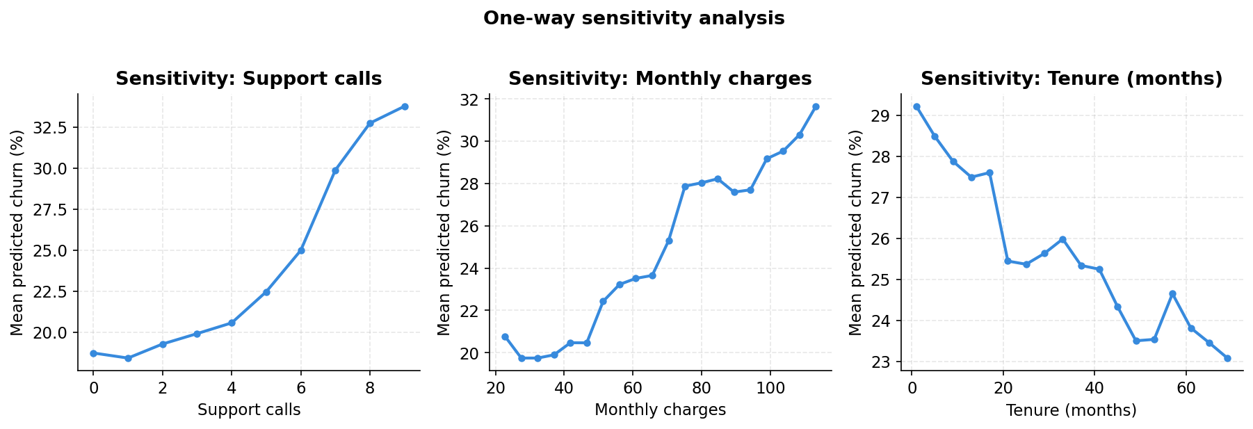
The notebook sweeps three features individually across their full range, holding everything else at test-set values, and watches how mean predicted churn responds. This is a model audit as much as an analysis.
Support calls produce a sharp near-linear increase in predicted churn from roughly 7% at zero calls to 30% at nine. Monthly charges show a gentler upward slope, consistent with the quintile chart. Tenure is the most striking: the model assigns the highest churn risk to the newest customers and the curve falls steeply in the first 12 months before levelling off. By month 36 the marginal protective effect of additional tenure is small.
These curves should make intuitive sense to anyone who knows the business. If they do not, the model has learned something spurious and you need to investigate before deploying it.
Risk tiers: what the retention desk sees
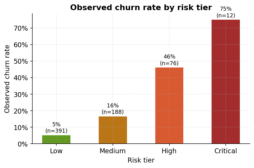
The last chart closes the loop. The notebook assigns every test customer to one of four operational risk tiers based on their predicted probability. Low tier (under 25% score): observed churn rate 5.1%, 391 customers. Medium tier: 16.5%, 188 customers. High tier: 46.1%, 76 customers. Critical tier (above 75% score): 75.0%, 12 customers.
The tiers hold. A customer in the Critical tier is fifteen times more likely to churn than one in the Low tier. The model is doing its job. And the tier sizes tell the retention team exactly what kind of capacity they need: 88 customers in High or Critical combined is a manageable contact list for a weekly retention run.
